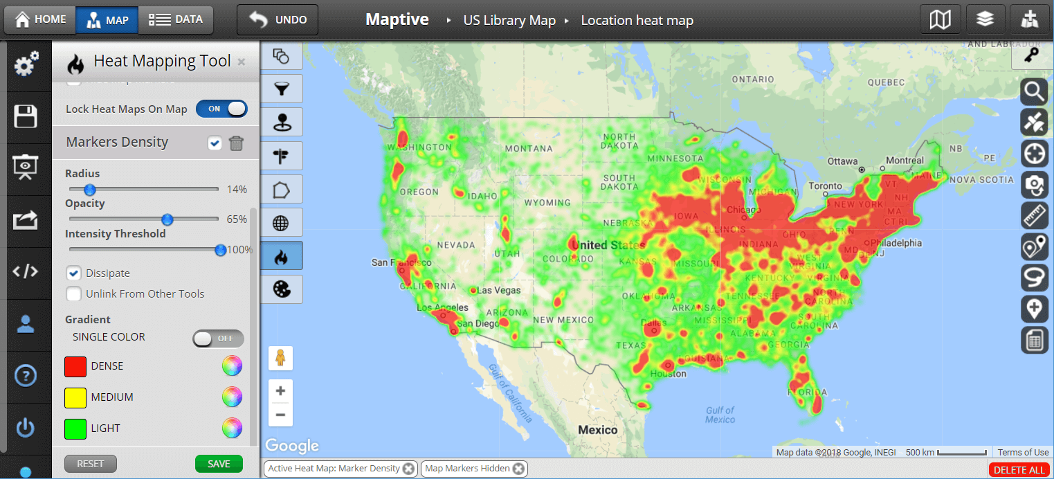
Create a heatmap
Heatmaps display colors on the map to represent the density of points from a table.
Requirements
Table of Contents
The table must have a Location column that contains individual points. These can be latitude/longitude pairs in a single or separate columns, geocoded addresses, or KML with <Point> elements.
If all of this is too complicated for you, you can always check alternative software for Google heat map creation which might better suit your needs.
Creating a heatmap
- Go to a map tab, or use [+] Add map to add one.
- If the map configuration panel isn’t showing, click Tools > Change map.
- Click on the Heatmap item to the left of the map.
Changing the heatmap’s appearance
- The Radius slider sets the radius of influence in pixels. Higher values result a smoother appearance.
- The Opacity slider controls how transparent the heatmap colors are.
- The optional Weight column adjusts each point’s importance by multiplying its intensity by the specified column value.
Limits
Heatmaps use the Maps API Heatmap layer, so they pull data into the browser before displaying it. This is unlike Fusion Tables feature maps that render map tiles on the server. Because of this, only the first 1,000 rows are mapped. You can add filters to your map to keep the row count under the limit.
Heatmaps of geocoded addresses can be viewed in Fusion Tables but cannot be published. Publishing would extract the geocodes, which is not allowed by the Google Geocoding API’s usage limits.
Publishing
The HTML/JavaScript generated in the dialog shown with Tools > Publish uses the Fusion Tables API to fetch the rows, parse them for use in the heatmap, and draw the map. If you plan to have more than minimal traffic for the map, you need to get an API key and enter it into the publish dialog’s API key field. That will be included in the generated code.