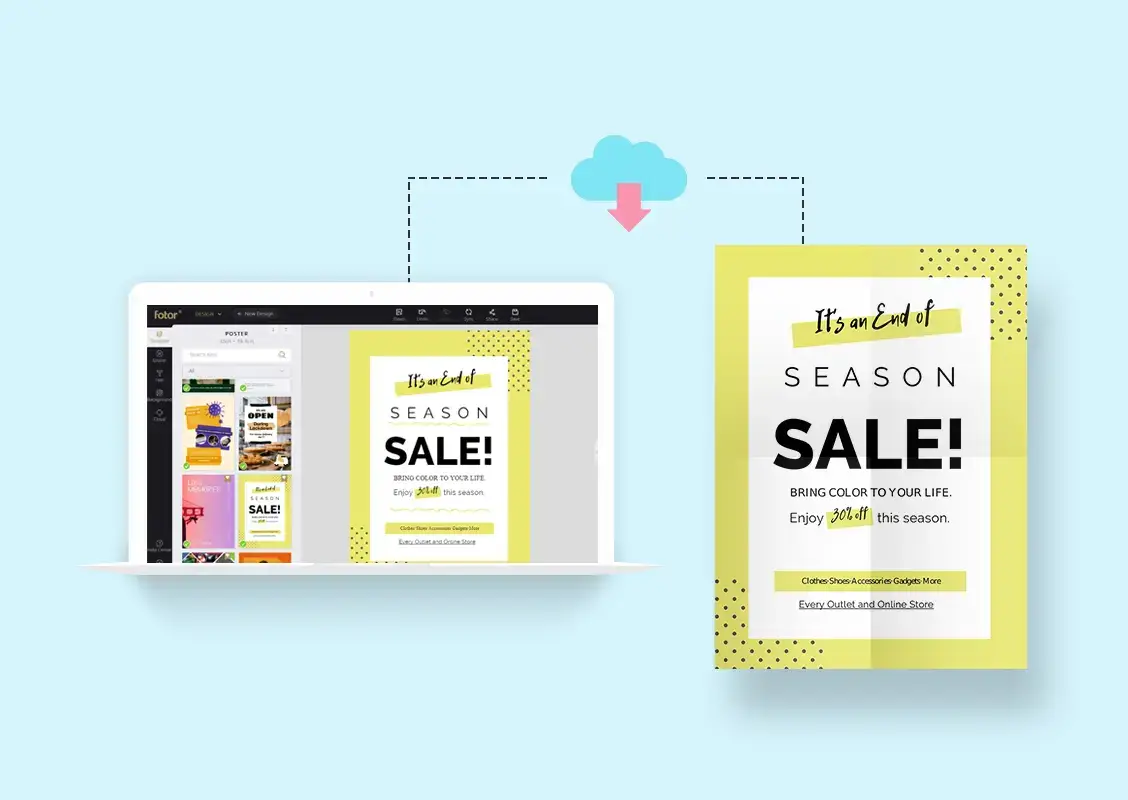

promotional poster
Posters are one of the most traditional, time-tested, and effective pieces of marketing collateral. Free online posters are an excellent marketing tool to grab attention to sales, events, fundraisers, and other activities.
While there is no one correct technique to create a poster, there are some best practices for a poster design that you should adhere to achieve the greatest results. As a result, we took it upon ourselves to develop the most comprehensive and in-depth poster design guide available anywhere online.
These poster design suggestions can be used for nearly any type of poster that you create. So let’s get this party started!
Table of Contents
Do you wish to share information about a new product with someone? Inform them of a concert taking place in their area? Alternatively, you might inform them that a sale is about to begin. Each of these goals can be met with the help of a poster.
If you start with a clear understanding of your primary objectives, you can utilize that understanding to influence your design decisions.
Consider this: If the purpose of your poster is to encourage people to attend a conference, the poster should be designed in a way that will assist you in achieving that goal. When it comes to written communication, the rule of thumb is that less is more.
You must establish an outline to ensure that the information you’re giving is clear, clean, and concise in its presentation.
It may appear to be a good idea to include as much information as possible on the poster, but this is not always the case. In the case of an event, the specifics would be as follows:
The color scheme of your design is likely to be the first thing that your audience notices about your poster (especially if they are viewing it from a distance); therefore, you must get it properly.
Color selection may be one of the most fundamental visual design elements, but it can be difficult to master if you’re unfamiliar with color theory and its applications.
Posters featuring dramatic and current pictures have become standard practice in recent decades.
The poster on the right can significantly increase aesthetic appeal over the poster on the left. In reality, your image can express far more information than plain language ever could.
Selecting a suitable photograph for your free online posters should be straightforward if you have previously established your brand’s image and personality.
After that, it’s time to take your title and elements from your plan and incorporate them into your poster.
There are two issues you’ll need to address at this point to ensure that your text elements are consistent with your photos and other graphic elements.
A considerable impact on the mood and message of your poster will be exerted by the fonts that you choose.
As crucial as the typefaces you choose for your free online posters is how your content is put out on the page. The most important guideline to remember in this situation is visual hierarchy.
When it comes to text components like your headline and call to action, you want to leverage their size and placement to direct the reader’s attention to where to look.
If your poster includes a call to action (CTA), make certain that it is clear and visible to the reader.
Because the entire purpose of a CTA is to compel people to take action, it only makes sense to draw people’s attention to it, but not to the point where it overshadows your title.
It would be best if you gave your poster a once-over once you’ve structured your text and pictures in the manner that you choose. It’s often helpful to have a second pair of eyes go over your flyer before distributing it. It’s not immediately obvious about the fact. Is there a color that is too loud or too light? Do the visuals appear neat and well-placed, or do they create the impression of being cluttered? Answering these questions will assist you in editing and filtering out any extraneous material, as well as adding in anything that may be missing. Before posting, make sure to proofread your work for errors in spelling and grammar.
Anyone may create their promotional materials for any occasion if they keep these concepts in mind when doing so. There’s no limit to how basic or intricate your design is. Whether you place your text into a pre-made framework or completely remodel your template, you can be confident that you’ll end up with a final result that is sleek, professional, and ready to draw a crowd for your next major event.
Fortunately, there are now tools that make image design easier than ever before, with pre-made templates that will give you a head start while also inspiring you to come up with your ideas on your own. These super-simple guidelines will show you how to build a poster in Poster my wall on your own, and you’ll be well on your way to having high-quality graphics that are ideally matched to your event or content.
Are you wondering how to streamline your study plan effectively? Do you feel overwhelmed by… Read More
In today’s world, where the digital revolution accelerates by the second, technology is not just… Read More
When your business runs paid ads across multiple platforms—Google, Meta, LinkedIn, and the rest—it’s easy… Read More
Among many students, are you also dreaming of studying in your favorite destination, America? Many… Read More
The last few years have caused a dramatic shift in the procurement landscape as organizations… Read More
Creating an attractive, professional website doesn't have to break the bank. With strategic use of… Read More