Is Webflow Good for Web Development?
You’ve got a business idea and want to quickly launch a website to test and promote it. But you don’t know how to code. Should you bother trying to learn, or is there an easier way?
Enter Webflow – the visually oriented platform that allows anyone to design and publish responsive websites without coding them.
While it doesn’t have the complete flexibility of hand-coding, Webflow offers impressive design capabilities and built-in CMS tools to build sites rapidly. But performance-heavy sites and e-commerce may not be its strong suit.
That’s why the question “Is Webflow good for web development?” has an “it depends” answer. But if you understand Webflow’s sweet spots and limitations, you can strategize how it may work for your site (or not).
Read on to learn more about Webflow’s features, usability, pricing, and more to assess if this platform fits your needs.
What is Webflow?
Table of Contents
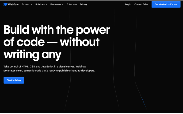
Webflow is an all-in-one website builder that lets you create sites and online stores straight from your browser. The San Francisco-based company bills itself as a “no-code,” “cloud-based design tool.”

Basically, Webflow is a service you subscribe to instead of installing any software yourself. And they want non-techies to feel comfortable designing full-featured websites without needing coding skills.
Webflow also lets you edit CSS and add your own HTML/JavaScript if you want more flexibility. But their drag-and-drop interface is designed for visual learners to have full control without code.
There are two main ways to use Webflow:
- Design/ build your site fully in Webflow and host it on their servers. It’s super easy to manage right in the editor afterward.
- Design in Webflow but export the code to host elsewhere. That’s better for developers comfortable with custom hosting setups.
Most folks go the first route since Webflow hosting is optimized for sites made in their builder.
You’ll find tons of customizable templates to kickstart your design and powerful features to make your site stand out. Webflow aims to give both coders and newbies pro-level results.
Who Uses Webflow, and How Many?
Webflow aims to be a one-stop shop for all kinds of creators, from:
- Solopreneurs (Entrepreneurs working alone)
- Small business owners on a budget
- Freelance web design professionals
- Full-fledged agencies
- Even big brands and tech companies
When picking a platform for your business site, you’ll want to know it’s built to last. Good news – Webflow just scored over $140m in funding for future growth. And their $4 billion valuation suggests they’re here for the long run.
Data from website stats site BuiltWith shows around 482k live sites made with Webflow. And their clients include big names like Zendesk, Dell, and Upwork, too.
How Easy Is It to Start Using Webflow?
Sure, any new design tool takes some learning. But Webflow eases the learning curve with incredible resources.
Start by smashing their “101 Crash Course” tutorial for the visual editor breakdown. Then, dive into projects and use the lively forums when stuck. Each discovery expands your skills.
If you commit to their University courses, you’ll get comfy with Webflow in no time. Soon, templates and code will flow naturally.
Making Sense of Webflow Pricing
Figuring out Webflow’s price tags can feel confusing since there are three sets of plans to unpack – “Site”, “Ecommerce” and “Workspace”.
Site and E-commerce Plans
The “Site” and “E-commerce” options are pretty straightforward, taking a page from the Wix and Shopify playbook. You pay a monthly fee and get everything you need to build and host your site or online store.
Here’s the lowdown on “Site” and “E-commerce” pricing:
Site Plans
- Starter (free)
- Basic ($18)
- CMS ($29)
- Business ($49)
E-commerce Plans
- Standard ($42)
- Plus ($84)
- Advanced ($235)
As for differences between “Site” tiers, it basically boils down to things like CMS items, monthly traffic, storage space, and editors. More expensive = more of everything.
The “E-commerce” variations revolve around product quantity (500/5,000/15,000), transaction fees (2% in Standard vs 0% in Plus and Advanced), and supported staff accounts (3/10/15).
Hence, the pricier the plan, the more juice you get out of Webflow. Just decide how feature-filled you need your site solution to be.
Workspace Plans
While the “Site” and “E-commerce” options are perfect for solopreneurs, “Workspace” plans cater more to agencies and companies.
These let you juggle multiple projects and collaborate across teams. Even better, you can export your finished site code to self-host or hand it off to developers for custom features. Just be aware that you lose their slick content editor in the process.
There are six tiers in total:
- Starter – $0
- Freelancer – $24
- Core – $28
- Agency – $42
- Growth – $60
- Enterprise – Custom priced
“Freelancer” and “Agency” aim to serve web designers hitting clients up with Webflow builds. The others work for individual or company-wide use cases.
Key differences involve user limits (1 to unlimited), managed sites (2 to unlimited), publishing controls, coding access, and export options.
Plus, fancier “Enterprise” accounts score advanced security and a dedicated “customer success” contact for that white glove support.
Now, here’s the catch about these Workspace plans – none of them include hosting or let you use Webflow’s content management system. And you can’t map a custom domain like yoursitename.com.
To get all that, you must buy one of their “Site” or “E-commerce” plans on top of your Workspace plan. And it’s probably Webflow’s biggest turn-off.
But if you can wrap your head around it, Webflow has some really nice features to work with. Let’s break those down next, starting with the visuals.
Webflow Templates
Instead of starting from a blank canvas, Webflow gives you thousands of templates to launch from.

Number of Templates
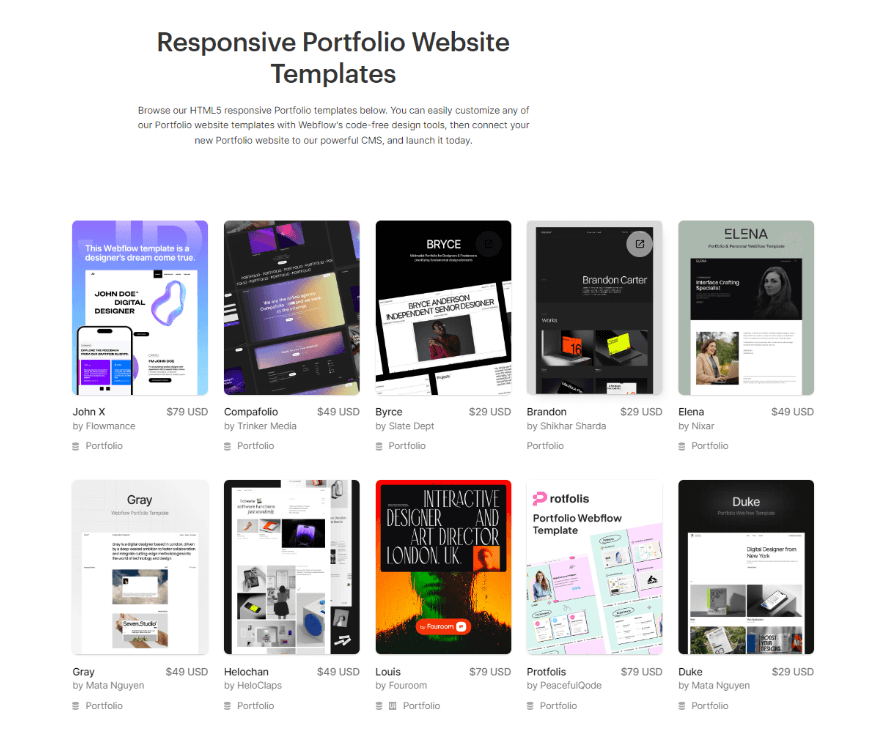
The Webflow Marketplace currently houses over 2,000 templates. And get this – 49 of them are completely free to use however you please.
You can search with ease, too. Just filter by industry, language, style vibes, or specific attributes, so the perfect fit is just a click away. From sleek landing pages and online stores to full-fledged corporate sites – there’s a template for just about any project need.
Quality of Templates
Webflow organizes its massive template collection into handy categories like portfolios, design studios, blogs, healthcare sites, and e-commerce stores.
They have sleek, modern designs that will blow your mind. The pre-built landing pages, data forms, checkout flows, and background videos are all fully customizable, too.
Where Webflow templates truly shine, though, is their engaging interactions. Using the “Webflow interactions” feature, designers bake in scroll effects, zooming, hover states, and animated page transitions. It’s easy to see why sites made in Webflow stand out from builders like Squarespace and Shopify.
Typeface Options
Webflow gives you access to over 1,500 free Google fonts and a mind-blowing 20,000+ types from Adobe Fonts.
That’s way more options than competitors like Wix, Shopify, and BigCommerce whose libraries pale in comparison.
And if those massive libraries still don’t have your perfect font? Webflow lets you upload custom types in five formats:
- TTF/OTF
- WOFF
- SVG
- EOT
- WOFF 2.0
Templates Built for All Screens
Webflow templates flex to any device like no other. Besides full responsiveness on all screens, you get a dedicated mobile canvas to tweak small screen layouts to perfection.
It gets better – Webflow lets you test drive your design on actual iPhone, Samsung, and other device simulators. Since you can’t build separate versions, being able to “test drive” on different phones means you can choose what’s right for your business.
But You Can’t Switch Webflow Templates
Most site builders let you swap templates on a whim. But not Webflow – once you pick a starting point, that’s it!
So, when scouting templates, take your time test-driving each one. Webflow helps by letting you preview live versions and fool around in templates right in their designer. Your changes won’t save unless you purchase paid templates.
Still, It’s Not All About Templates: The Power of Webflow Classes
Templates are a great starting point, but what truly gives Webflow its strength is the ability to manage styles across entire sites. At the core of this is the use of CSS classes.
In Webflow, you style elements visually as you would expect. But instead of those styles only applying locally, you can turn them into reusable classes. This allows you to quickly update styles sitewide without hunting through code.
Need to change the font on every heading? No problem, just update the class. This level of control vastly streamlines the design process compared to traditional code-based workflows.
Besides, tools like Flexbox and CSS Grid unlock incredible layout possibilities. In Webflow, you can build with them visually rather than navigating documentation.
You can see your changes instantly instead of saving and refreshing. Also, you can craft rows, columns, and more through its intuitive drag-and-drop. This makes complex structures approachable for any user.
Content Management System and Webflow Interface
Whether starting fresh or sprucing up a template, the Webflow designer is where the magic happens. But this isn’t your average drag-and-drop interface.
Unlike heavy hitters like Shopify, Wix, BigCommerce, and Squarespace, Webflow doesn’t toss you right into building. Their editor requires some web design know-how.
Specifically, understanding HTML’s “box model” and CSS styling is key. If those terms are new, plan to dive into their learning materials like tutorials and articles in “Webflow University” until it clicks.
So, Webflow probably isn’t your pick if set-up-and-forget site-building is your vibe. They aim higher than that – at helping you achieve ultra-customized, tech-heavy visions.
The Webflow designer
Webflow designs for full responsiveness out the gate. Why? Because Google rewards sites optimized for all devices in search. In the designer’s central canvas, you’ll find tools to finesse your layout for:
- Desktop
- Tablet
- Landscape phone
- Portrait phone
Plus, you get options to add even more precise sizes – way deeper control than Shopify, Squarespace, or GoDaddy offers.
Elements like sections, buttons, and blocks snap onto the left bar and can be styled on the right. Basic HTML/CSS know-how is required to name things efficiently and keep projects tidy.
Webflow just got creative filters, too. With blurry backgrounds, color layering, and things like that, it’s like having Photoshop for websites.
Certainly, there’s a learning curve for Webflow’s designer – it’s not totally visual drag-drop. But take the tutorials, be willing to get your hands dirty with code, and before you know it, you’ll be a pro.
Content Importing and Exporting
Bringing content into Webflow happens through CSV files. But anything over 50 items means a paid plan.
“CMS” or “Business” lets you bulk 2,000 in, while higher “Plus”/”Advanced” tiers bump that to a tidy 10,000.
Webflow takes a wide variety of image formats too – JPEGs, PNGs, WebPs, and GIFs up to 4MB. CSV uploads work by linking to live URLs only though, no local computer attachments.
They ingest other types of files as well:
- PDFs
- Word docs
- Excel sheets
- PowerPoints
- Plain text
- And more
Animation junkies especially love importing funky JSON “Lottie” files to breathe lively movement into sites.
Export options are solid, too. You can pull content out in CSV form, with image/file URLs instead of the full downloads. Plus, paid workspace plans let you extract your clean code for self-hosting or backups.
Images and Galleries
Unlike builders like Squarespace and Shopify, Webflow doesn’t offer in-app editing tools for touch-ups. You’ll import pics exactly how you want them. But then? Placement is a cinch – just drag and drop where desired.
While built-in gallery options may seem limited at first (sliders, lightboxes, grids), you can customize them to your heart’s content. Plus, full responsiveness across devices is guaranteed.
Webflow also ensures your shots will look diamond-sharp on hi-resolution screens with HiDPI compatibility. Brands that care about crisp visuals shouldn’t worry.
And though the occasional gallery may leave you wanting, Webflow empowers truly unique image combos through custom CSS designs. You can bring your creative visions to life beyond templates.
Webflow Custom Interactions
Webflow sets itself apart with wild animation options across every inch of your builds. And get this – their “Interactions” let you bring complex JS to life without writing a single line of code! Just tweak presets like “fade,” “shrink,” and “jiggle” right in the editor. But that’s only the start.
Where Interactions shine is customizing wild “triggers” to thrill users during every type of engagement. Hover over an image? It dances while the text is unveiled below. Scroll past? Element whizzes into view.
The options are endless. But it does take practice to get the hang of. Yet, Webflow tutorials and sample projects help massively with that.
Backups and Version History
From the second you launch your Webflow project, it’s backing you up. And we mean constant backups – every few minutes, round the clock. It’s included with all plans, too.
Their version history lets you rewind with a single click. Broke the latest change? No sweat, just spin back the clock. This safety net gives Webflow a clear leg up on competitors. Take Squarespace – also great for visuals but lacking this protection.
Can You Integrate Webflow with Other Apps?
Out of the box, Webflow plays nice with 250+ apps through their expansive integration library. You can connect to email tools like GetResponse and Mailchimp, form builders, and all your favorite social platforms.
Even better, you can integrate custom plugins from fellow Webflow devs. These unlock handcrafted magic like advanced filtering, chat widgets, sliders, and beyond.
Developers using Figma for sketches rejoice more, especially the “Figma to Webflow” plugin beams over designs with a single paste.
What about Forms and Data Capture?
Webflow tools your data capture with slick forms. Out of the box, you get pre-styled contact/newsletter boxes, or you can build custom dreamscapes from scratch.
You can add any element – custom fields, autofocus targeting, captchas, you name it. Tailor success/fail messages on the fly too.
Best of all, you can save creations as reusable components to drop anywhere on your sites, whereas most builders bog you down by repeating from page to page.
The submission destination is email by default. But you can hook up to Sheets and beyond using a handy Zapier. Or, you may flex coding muscles with direct APIs.
Just be warned – form limits apply across plans from 50-2,500 submissions monthly. Breech that, and fees of $1 per additional 100 await.
Does Webflow Have Good Page Speed?
Blazing-fast page loads bolster your presence in search. So, we tested Webflow templates – scores consistently cleared 90 on Google’s PageSpeed Insights tool.
Animations or bloated starting templates may slow the roll slightly. Properly sized images are also pivotal – no worries there as Webflow preps multiple resolutions for any device.
For heavyweight pages, you can use the “image load” tool – set above-the-fold pics to “eager” and below to “lazy” for maximum efficiency bliss.
Sadly, Accelerated Mobile Pages support is minimal compared to platforms like Squarespace and Shopify that harness optimized mobile delivery. But for the average speedster site, Webflow cruises with the best of them right out the gate.
Is Webflow Good for E-commerce Development?
We’ve looked at Webflow’s killer content tools, but is it good for developing online stores?
Despite launching e-commerce profiles more recently than titans like Shopify and BigCommerce, Webflow packs solid core features. Take payments with Stripe/PayPal, stock physical and digital products, and customize checkouts to perfection.
However, Webflow isn’t yet offering many of the e-commerce features that more established store builders do. The limitations include:
- Only two payment processors supported are a drag, compared to competitors’ long lists.
- Physical point-of-sale needs are a no-go with no integrated card readers or receipt printers.
- Abandoned cart reminders also require paid third-party tools rather than being baked right in. Translation and currency options, too, involve added costs.
- Webflow stores aren’t quite set up for heavy dropshipping either, though Printful prints are covered.
- Digital inventory must live off-platform instead of natively within Webflow itself.
- While tax calculations are part of the package, EU VAT rules aren’t fully addressed.
- Webflow’s ‘Standard’, ‘Plus’, and ‘Advanced’ e-commerce plans limit your sales to 500, 5,000, and 15,000 products, respectively.
So, e-commerce newbies are better off with dedicated platforms. But Webflow shows promise for experienced multi-channel merchants to flex creative control. More store features are on the horizon, too.
Conclusion: Is Webflow Good for Web Development?
While lacking some e-commerce bells and whistles, Webflow delivers everything visual builders crave. The platform’s fluid customization flies, thanks to robust features and clean interfaces.
For designers who value intricate styling over plug-and-play shopping carts, Webflow soars. And its evolving arsenal ensures even more surprises down the road.
As Webflow expands, developers and artists alike continue fueling unprecedented visual magic. We can expect more big things ahead – this platform is just getting started.


